3 SALE-KILLING MISTAKES TO AVOID WITH REAL ESTATE LISTING PHOTOS
By Craig Donofrio | Nov 14, 2016
We’re fond of the analogy that shopping for real estate is a lot like online dating. The similarities are seemingly endless—you should never be too eager, and you have to remember that looks can be deceiving.
That’s never more true than when it comes to presenting your home in real estate listing photos. You can have the most sought-after home on the block, but if you don’t take the right pictures, your house might attract more squatters than buyers.
Don’t believe us? Check out these cringe-worthy photos we found while scouring the multiple listing service. Learn from them, young Padawan.
1. No more corners, ever!
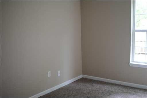
For some reason, sellers really like to take pictures of corners. Cold, lonely corners. Nothing is gained from a potential buyer peering into a photo of a barren corner. After all, every house has corners.
Hannah Walker, vice president of IMOTO Real Estate Photography, says you should photograph “at least two corners of a room” to get a sense of space and design. Not two separate photos of corners, mind you—one photo, two corners.
———
2. Forget about the fish-eye angle

While they’re not common, we do see photos where the photographer wanted to get artsy with a fish-eye lens.
“A fish-eye lens distorts the size and shape of the room,” Walker says. “The goal of good photography is to represent the home like it exists in real life”
She recommends trading in the fish-eye lens for a wide-angle lens, which would “accurately capture the entirety of the room, while not distorting it and making it look unrealistically large.”
———
3. The grass is always greener

Photos of surrounding nature make sense when notable flora or fauna are featured. You know what’s not notable? A close-up of a tree. Or a patch of grass. Just take a few steps back and take a wide shot of the whole house, with all the foliage. Sod is sad!
———
4. Outside looking in
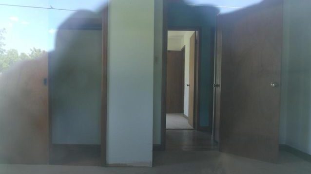
So, the photographer doesn’t even bother going into the house. Is there a restraining order in place? A wise buyer would keep far, far away.
———
5. Still life of a ceiling fan

Home sellers just looooove offering up pictures of ceiling fans. Not fancy ceiling fans, but those got-it-from-Home Depot ceiling fans. You can install these in a weekend—why focus on something that’s not exactly a sought-after amenity?
Take a step back and aim to “photograph the look and flow of the property,” rather than just zooming in on something, Walker advises.
———
6. A haunted look doesn’t help

If your photo makes your home look like it’s filled with supernatural stalkers, rethink your life.

Grainy photos can make a house look menacing, as can deep shadows. Grainy photos are due to a high ISO (here’s a quick primer on understanding ISO). Shadows fall into the frame when the angle is wrong, or photos are taken with a smartphone.
———
7. Let the sun shine in

Never show a house with the drapes closed. In fact, natural light is scientifically proven to sell homes faster and for more money. So give buyers what they want.
“Open all blinds and curtains to let that natural light into the room,” Walker recommends.
———
8. Clean up your dang clutter

If you can’t stage your home, at least keep it clean. And if you can’t get rid of an odd item, at least move it out of the shot. Why would you take a photo of a lawn mower inside the home? These are questions we’ll never have answers for.
———
9. A different perspective?

If you somehow wind up with a sideways shot, you simply have to rotate the photo 90 degrees with photo editing software. It’s the easiest thing to do, and if you don’t, it looks like you can’t be bothered with your home (or listing). Why should the buyer?
———
10. An utter mess

Nothing says “I don’t care” like a listing photo full of crud. Get a trash bag. Move it outside. Get a dumpster. Anything! Even if you don’t care, pretend to. A clean house is critical to a successful photo shoot, Walker says. Because it’s so important, her firm gives clients a “Pre-Shoot Checklist,” which includes tips such as wiping down counters and hiding power cables and trash cans from view.
———
11. Appliance close-ups

Almost every home comes with appliances, from ovens to water heaters. You really don’t need to waste photos on close-ups of these items. It’s like taking a close-up of your foot on a Tinder profile: Most people have one, and the only people who message you specifically about it are going to be weird.

So why do we see pictures more appropriate for the sale of a boiler room? “Close-ups of things like hot water heaters, breaker panels, etc. are likely taken in order to show the condition of the items,” Walker says. Her team tends to ignore those appliances—assessing their condition is best left to a home inspector.
———
12. Ban the blur

“Using a camera phone or taking blurry photos is unacceptable,” Walker says. Blurred photos happen to the best of us—but c’mon, man. Just go back and take another picture.
———
13. Flush bad bathroom angles
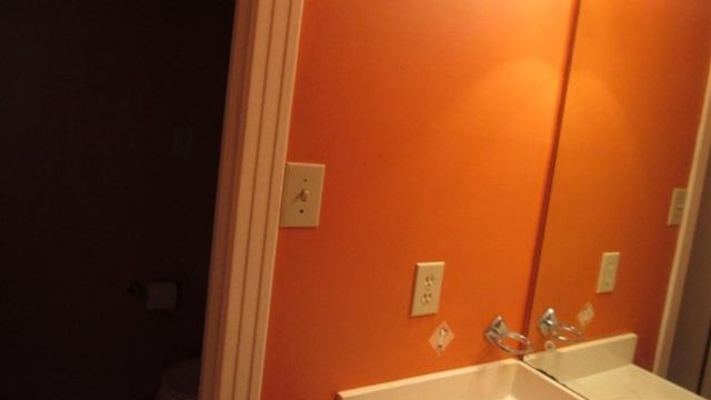
Aside from closets, bathrooms are usually the smallest rooms in the house. But that doesn’t mean they have to look small in photos. A photo at a proper angle can really play up the size of the room.
“Professional equipment, including a wide-angle lens and tripod, will help you capture the small bathroom shots,” Walker says. “Also, if you or the camera get caught by the mirror, edit it out.”
Craig Donofrio covers home finance and all things real estate for realtor.com. His work has been featured in outlets such as The Street, MSN, and Yahoo News.


